denny’s
brandING
Design & Art Direction:
Austin Warren, Adrian Gilling
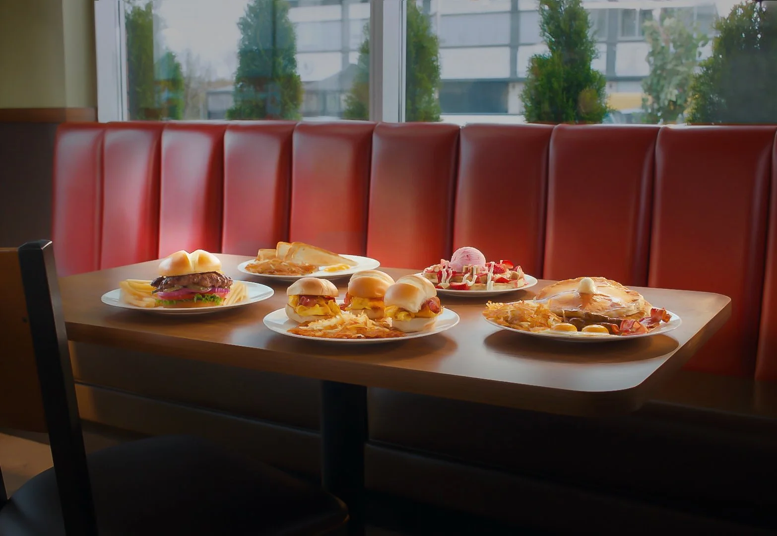
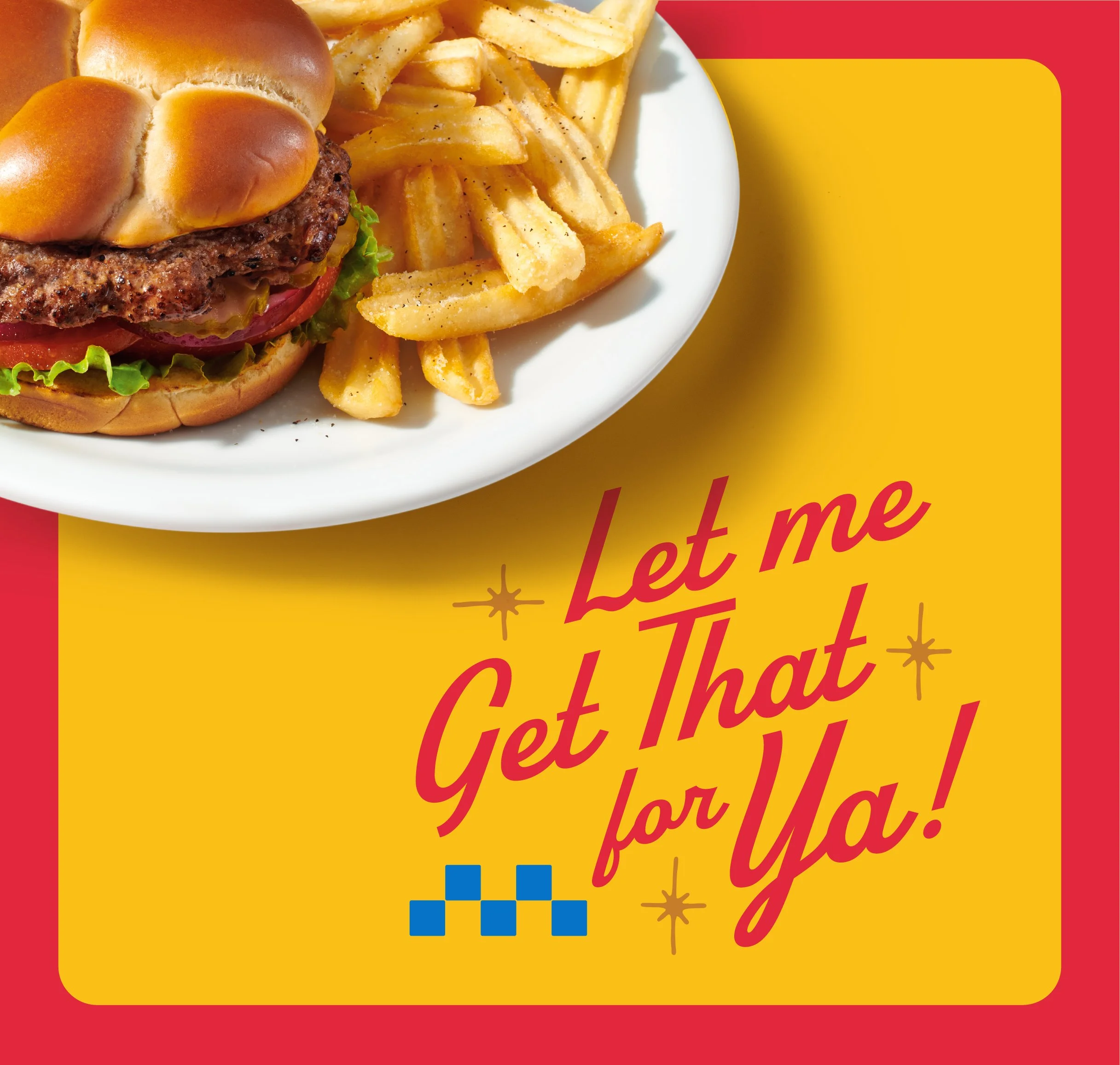
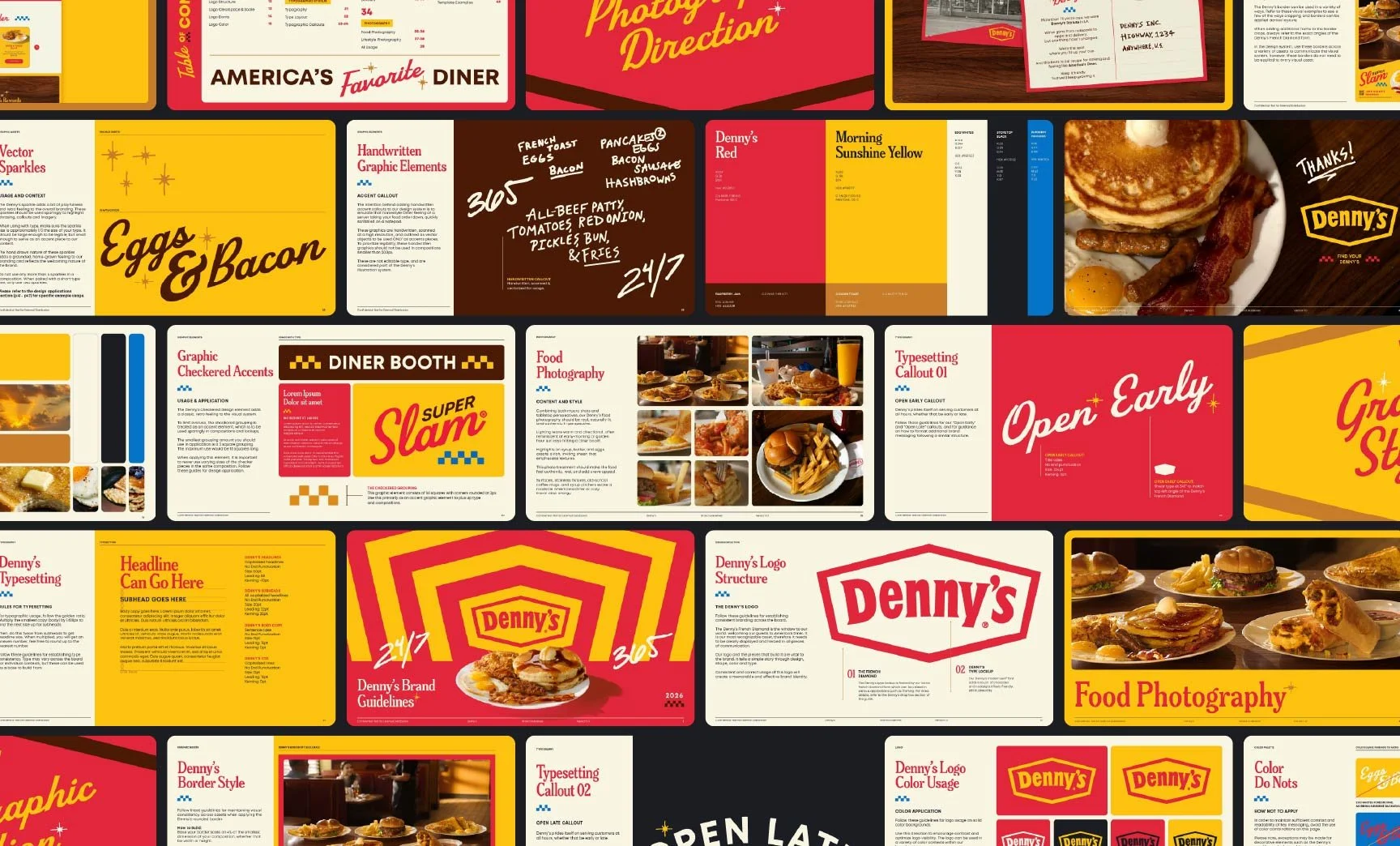
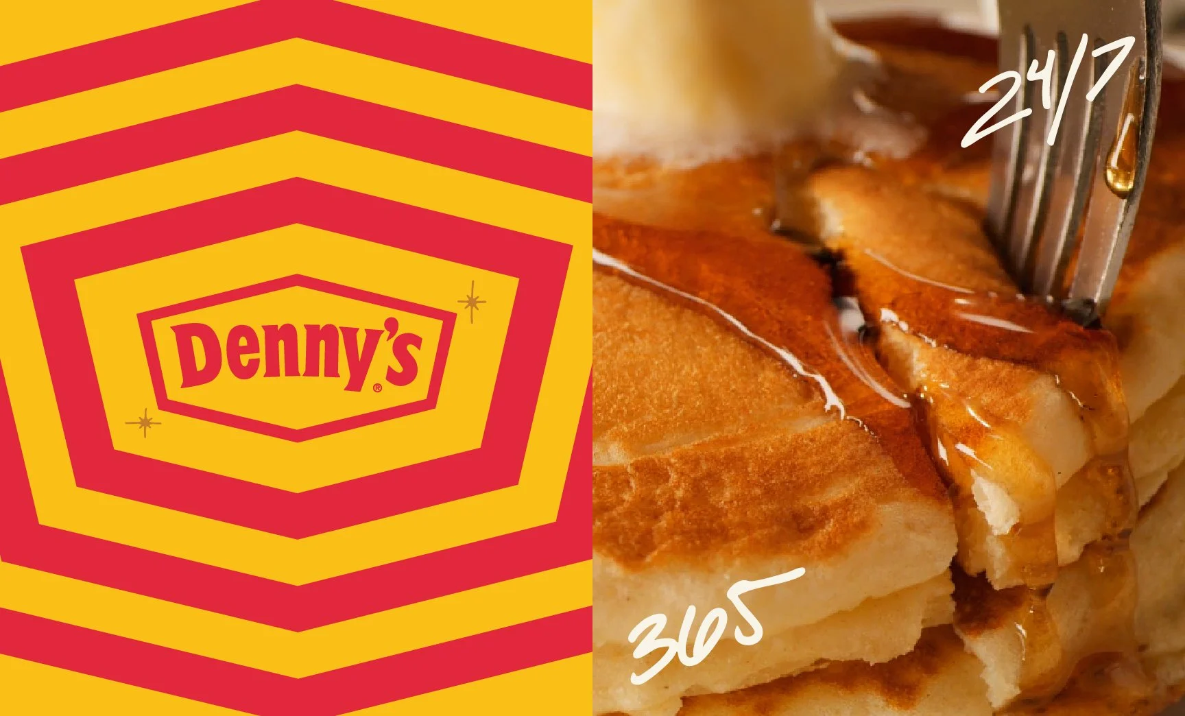
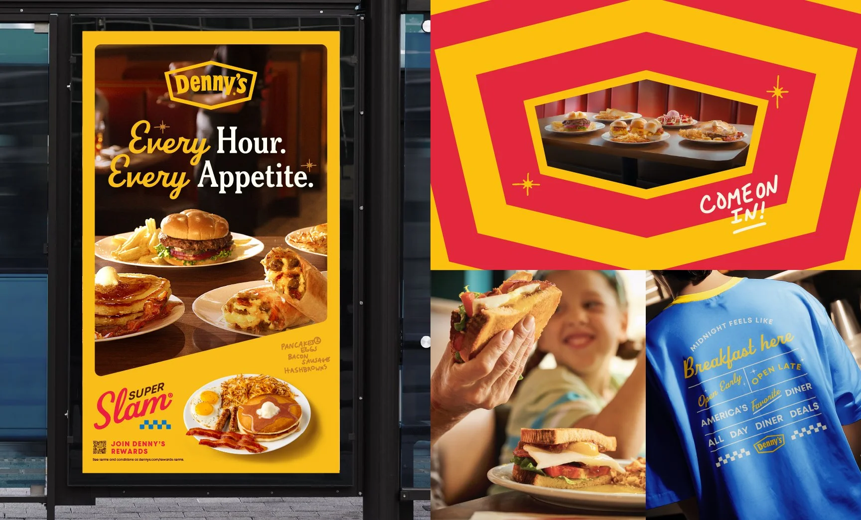
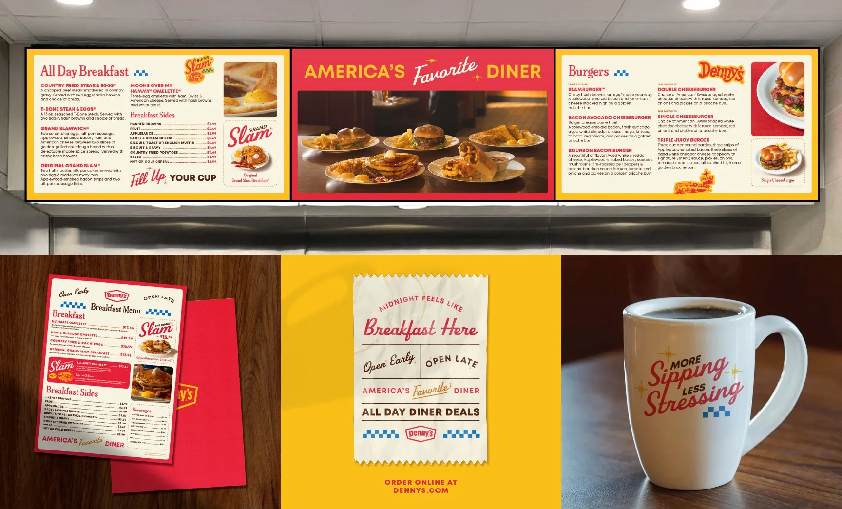
Built around high-contrast color blocking, expressive typography, playful handwritten elements and craveable food photography, the Denny’s design system creates a recognizable look that feels both nostalgic and contemporary.
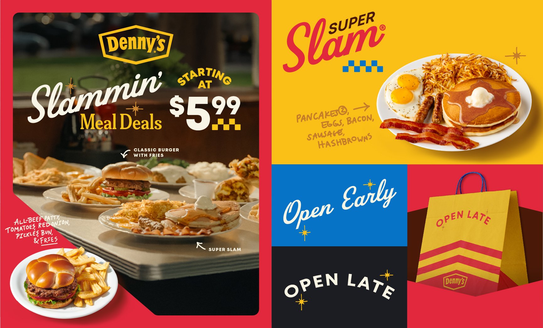

DIGITAL BANNERS
the branding background
Personal touches like handwritten lines inspired by server check notes, add personality and humanity to the brand voice, while highlighting the heart of Denny's diners: the servers.
Angled typography and image cropping reference the angle of the French diamond of the iconic Denny's logo while mid-ceåntury inspired starbursts pay homage to the brand's West Coast origins and longstanding brand history. The brand's photo direction is candid and inspired by classic Americana.
The core of the Denny’s design system consists of three distinct pillars: retro Americana (script lettering, mid-century modern starbursts, warm colors), modern editorial (oversized typography, bold color blocking) and handcrafted personality (handwritten notes, illustrated elements, checkered details).
These brand elements come together to create a welcoming brand identity that feels distinctly Denny's while staying flexible enough to extend across in-store signage, digital, social, packaging and promotional materials while maintaining a consistent, strong visual rhythm.